
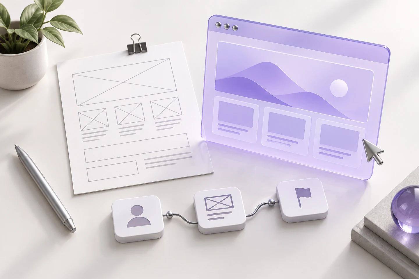
Start with one useful journey
A website brief often starts with a list of pages. We prefer to start with the visitor: who arrives, what are they trying to understand and what would help them take the next step? For a service business, that might mean identifying the right service, seeing how the team works and sending a clear enquiry. Write that journey in plain language before discussing colours or animation.
Give each section a job
A hero should explain your offer. A service section should help people decide whether it fits their needs. A contact form should ask for the information needed to start a useful conversation. If two sections repeat the same promise, consider combining them. If an important question has no answer, the design needs more than another decorative panel. Our review starts with these small, practical decisions.
Design with real content
We recommend working with actual service descriptions, representative images and realistic form labels early. A heading that looks elegant with three short words may behave very differently in Dutch. A mobile layout also needs space for long names and useful explanations. Bring those conditions into the design brief so that typography and layout support the message across both languages.
Agree on what completion means
Define the pages, languages, content responsibilities and enquiry route before development begins. Include a review of mobile layouts, keyboard navigation and the handover. Decide who will maintain the website and how updates will happen. This makes the brief a shared reference throughout the project, rather than a document that gets forgotten after the first meeting.