
Dutchey’s
A bright setting for a colourful product.
Product banner design for Dutchey’s. A sweets jar, fruit and oversized lettering share a warm yellow canvas, with red details bringing contrast to the composition.
- Our focus
- Banner design
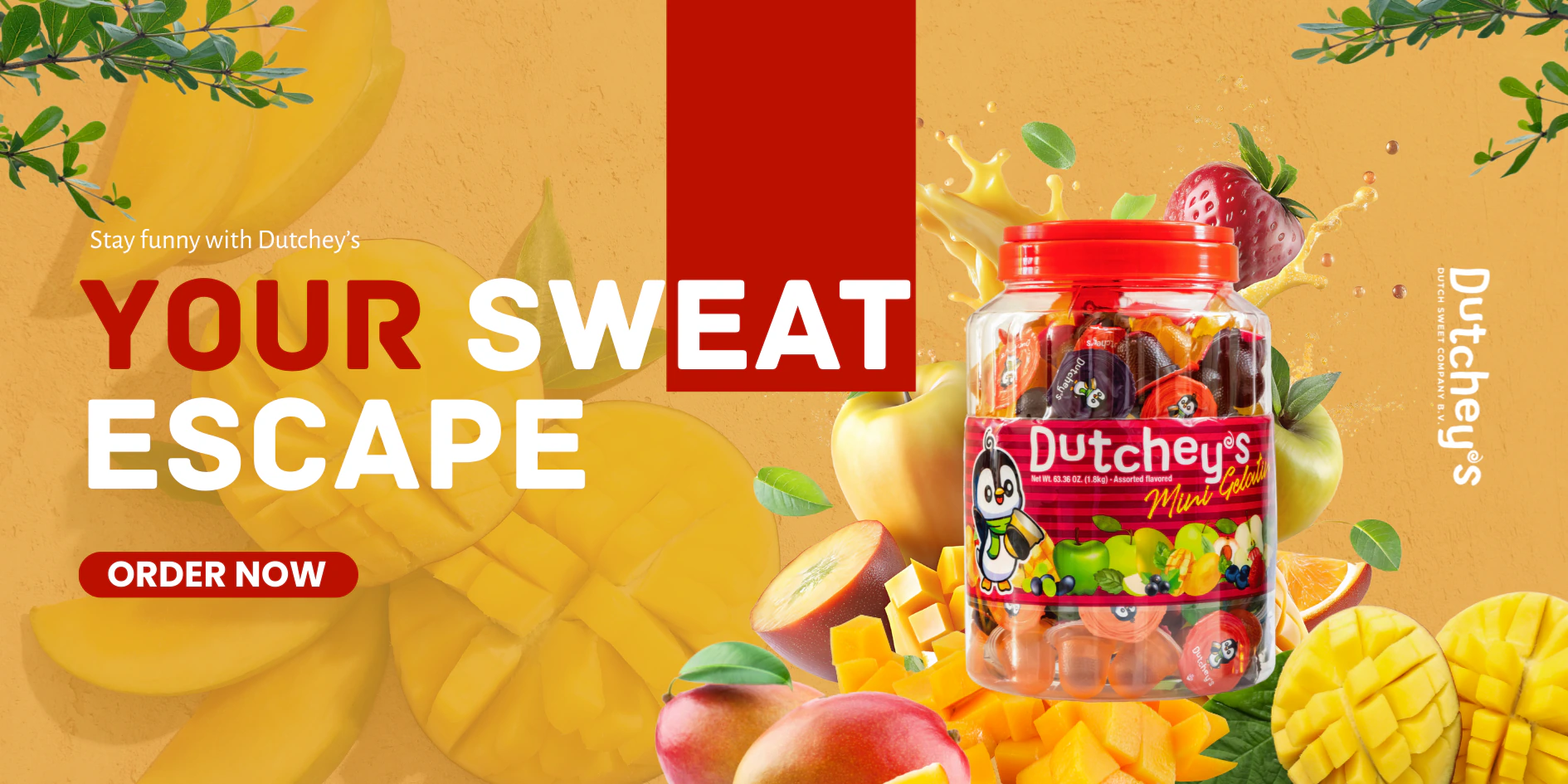
Dutchey’s - product banner design
01 / THE CONTEXT
Colour and scale set the hierarchy.
The jar anchors the right side of the banner, surrounded by mango pieces, fruit and leaves. Large lettering fills the left side, with a red call-to-action shape beneath it. The design uses overlapping images and changes in scale to connect the product with its colourful setting.
02 / OUR CONTRIBUTION
The banner in detail.
- 01
Product and fruit imagery
The large jar sits among layered fruit images, with leaves framing the outer edges of the banner.
- 02
Graphic hierarchy
Bold lettering and red graphic elements give the headline, product and ordering prompt distinct places in the layout.
YOUR NEXT PROJECT
What would you like to create?
Tell us about your brand, website or next idea. We can explore the scope together.
Discuss your project