Armes Kabak
A handwritten name, a composed signature.
Logo design for Armes Kabak hotel. Flowing script meets a restrained serif line, shown in gold against textured teal paper.
- Our focus
- Logo design
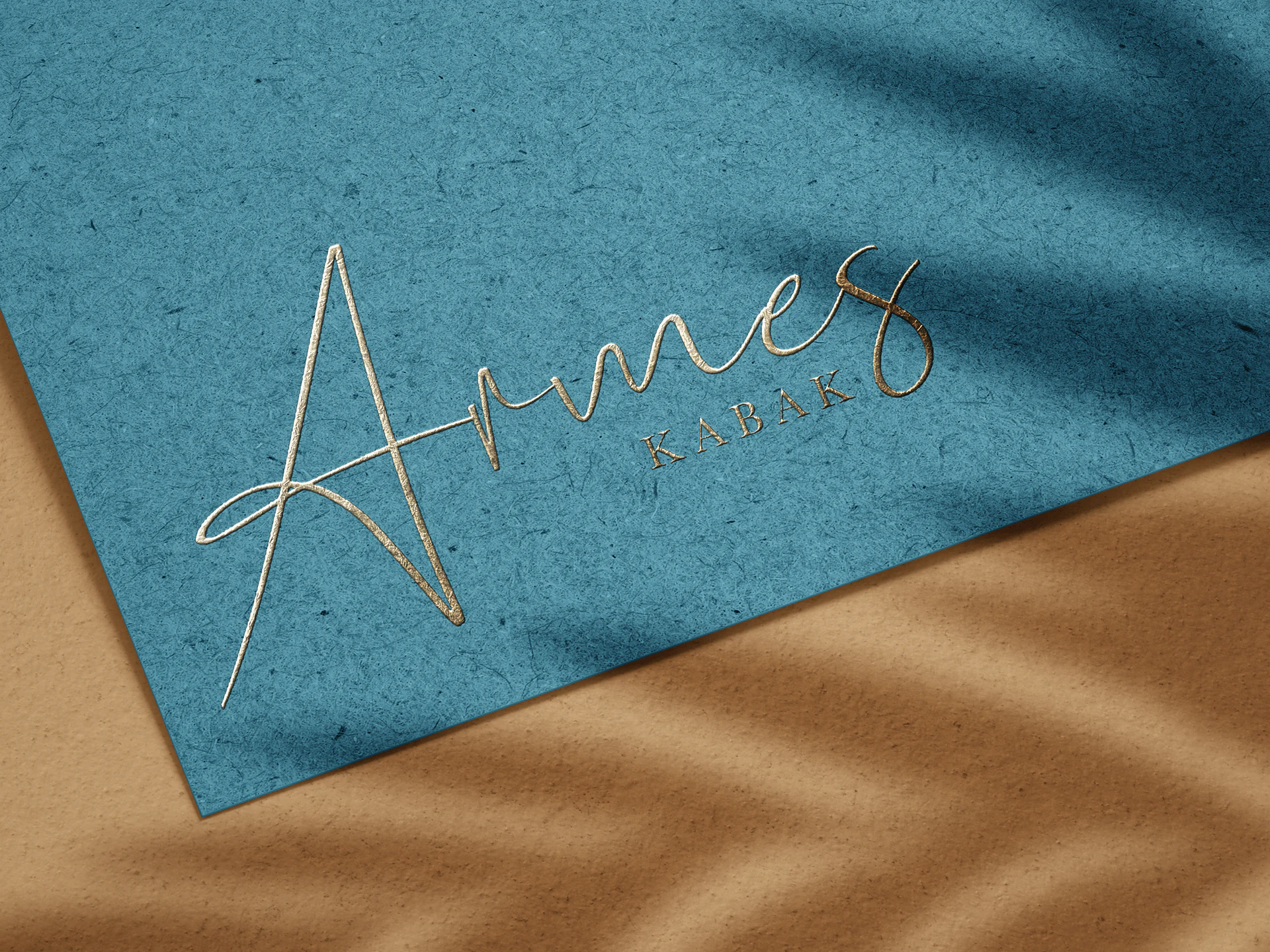
Armes Kabak - hotel logo design mockup
01 / THE CONTEXT
Two styles of lettering, one logo.
The Armes name forms the expressive part of the logo, with connected strokes and a sweeping first letter. Beneath it, the spaced uppercase letters of KABAK provide a quieter counterpoint. The presentation places the complete logo on a simple paper mockup.
02 / OUR CONTRIBUTION
The logo in detail.
- 01
Lettering and balance
The large Armes lettering sits above a smaller, widely spaced KABAK line, keeping the two names visually distinct.
- 02
Logo presentation
A gold treatment on teal paper shows the logo’s shape, spacing and contrast within a restrained composition.
YOUR NEXT PROJECT
What would you like to create?
Tell us about your brand, website or next idea. We can explore the scope together.
Discuss your project